Understanding the Foundation of Grid Systems
Grid systems are one of the most powerful tools in a designer's toolkit, yet they remain underutilized by beginners who find them intimidating or overly rigid. At their core, grids are invisible frameworks that bring order, harmony, and consistency to any visual composition. Whether you are working on a print layout, a website interface, or a social media graphic, understanding how grids function will transform the quality and professionalism of your work almost immediately.
What Is a 10x10 Grid?
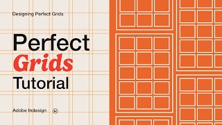
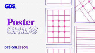
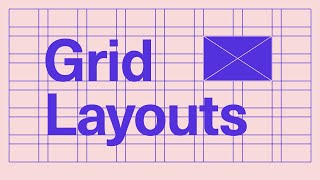
A 10x10 grid divides your canvas into ten columns and ten rows, creating one hundred equal modules. This structure is neither as sparse as a simple four-column layout nor as dense as a twenty-four-column editorial grid. The 10x10 system occupies a sweet spot that offers flexibility without becoming overwhelming, making it an ideal starting point for designers who are just beginning to explore structured layout techniques.
Each intersection where a column meets a row creates a node you can reference when placing elements. Margins, gutters, and module sizes can all be adjusted to suit the specific demands of your project. The beauty of this grid lies in its adaptability. A single element might span two columns and three rows, while a companion graphic could occupy five columns and stretch across the full height of the layout. These relationships create visual rhythm and guide the viewer's eye across the composition in a deliberate way.
Why Beginners Should Start With 10x10 Layouts
New designers often struggle with decisions about alignment, spacing, and visual hierarchy. Rather than relying on instinct alone, which can produce uneven or chaotic results, a grid provides a reliable structure that enforces consistency. A 10x10 grid is particularly approachable because it uses numbers that are easy to divide and visualize. Halfway points land cleanly at column five, thirds align near columns three and seven, and smaller fractions remain straightforward to calculate.
This accessibility reduces the cognitive load during the design process. You spend less time guessing where an element should go and more time making intentional creative choices within a clear framework. Over time, working with a structured grid trains your eye to recognize proportional relationships and balance, skills that transfer to more complex layout systems as your confidence grows.
Setting Up Your 10x10 Grid in Design Software
Most modern design applications include built-in grid creation tools. In digital design programs, you can define the column count, row count, gutter width, and margin size before applying the grid to your artboard or canvas. Begin by selecting the 10x10 preset if available, then adjust the measurements based on your document dimensions. For a standard desktop layout at one thousand twenty-four pixels wide, each column might measure roughly eighty pixels with a ten-pixel gutter, though exact values should reflect your project's scale and content needs.
Enable the grid visibility option so you can see it as you work, and consider snapping elements to the grid to maintain alignment automatically. Once you become comfortable, you may choose to hide the grid and rely on muscle memory, but keeping it visible during early practice reinforces good habits.
Building Layouts With the 10x10 Framework
When constructing a layout, start by blocking out major sections rather than jumping straight into fine details. Use larger modules to position headers, hero images, and primary content areas. A hero banner might span the full width across all ten columns and occupy the top three rows, establishing immediate visual dominance. Below that, a two-column content section could sit within columns two through six and rows four through seven, leaving breathing room along the edges.