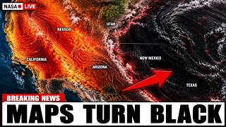
Understanding the Update Frequency of the US Heat Warning Map
During the peak of summer, millions of Americans turn to official weather resources to track the safety of their local environment. As extreme temperatures become more common, the National Weather Service (NWS) plays a critical role in communicating risks through its digital hazard maps. A common question for those living in regions experiencing prolonged heat waves is how frequently these critical tools are updated. Understanding the timing and mechanics of these updates is essential for staying safe during periods of hazardous weather.
The Real-Time Nature of Weather Alerts
The US heat warning map, hosted by the National Weather Service, is designed to be a dynamic, real-time reflection of current atmospheric conditions. Unlike static reports that might be updated on a fixed hourly schedule, the hazard map is updated continuously as data flows into the agency's systems. When a local National Weather Service office issues, updates, or cancels an alert, those changes are pushed to the national map almost immediately.
Because weather patterns can shift rapidly, the map does not operate on a set timer. Instead, it is event-driven. If a meteorologist determines that a heat advisory needs to be upgraded to an excessive heat warning due to rising humidity or higher-than-expected temperatures, the database is modified, and the map reflects that change within minutes. For the millions of Americans currently under heat-related alerts, this means the map is usually the most accurate representation of current government warnings available.
How Data Feeds Inform the Map
The information displayed on the map is derived from the Common Alerting Protocol. This is a standardized digital format that allows local NWS offices across the country to transmit alerts to a centralized system. Each local office is responsible for monitoring its specific geographic area. When local observers confirm that temperatures have reached dangerous thresholds, they input the warning parameters into their systems.
Because the process is decentralized, updates happen asynchronously. This means that while one region of the country might see its map status change at 10:00 AM, another region might see an update at 10:15 AM. The national map acts as a composite of these individual local decisions. This ensures that the information remains hyper-local and relevant to the specific climate and infrastructure of each region, rather than relying on a generalized national forecast.
Why Updates May Lag or Stall
While the goal is near-instantaneous updates, there are rare occasions where users might notice a slight delay in the map's responsiveness. High traffic volume during severe weather events can sometimes strain the servers hosting these digital resources. When tens of millions of people access the site simultaneously to check if they are in the path of a heat wave, the system may experience latency.
Furthermore, there is a distinction between the map itself and the underlying meteorological models. A forecaster might be tracking a heat dome that is expected to arrive in forty-eight hours, but the official warning on the map will not appear until the criteria for an alert are met or are highly likely to be met within a specific timeframe. The map reflects active warnings and advisories, not necessarily the broader, long-range outlooks that forecasters use to predict the harshest stretch of a heat event.
The Importance of Checking Local Sources
While the national heat warning map is an invaluable tool for a high-level overview, it is always recommended to verify information through local NWS office websites. These local pages often contain more granular details, such as the specific timing of when the heat is expected to peak, the duration of the event, and specific safety recommendations tailored to the local population.
In addition to the map, the NWS often issues text-based products that provide the reasoning behind a warning. These discussions are updated regularly by meteorologists and can offer deeper insight into whether an alert is being extended or if conditions are expected to improve sooner than anticipated. For those who need to make business or travel decisions based on the heat, these text products provide the nuance that a color-coded map cannot capture.
Staying Prepared During Prolonged Heat
The most important takeaway for anyone monitoring these maps is that they are meant to